4-2 R을 이용해 막대그래프와 파이그래프 만들기 table(), barplot(), par(), pie()
일변량 질적 자료의 분석: 막대그래프와 파이그래프 만들기
질적 자료는 개수를 세는 것이 기본 (Yes 가 몇 개 No 가 몇 개?)
따라서, 일변량 질적 자료를 얻기 위한 첫번째로
table 명령, 혹은 length() 함수를 포함한 도수분포표를 작성해야한다.
도수분포표 작성

막대그래프 작성
질적자료를 시각화 하는 대표적인 그래프는 막대그래프
barplot() 함수를 통해 막대그래프를 그릴 수 있다.

위 x축 레이블과 Y축 레이블은 한글로 써도 그래프 상에 표시가 된다.
barplot() 함수의 매개변수는 다음과 같으며, 이를 활용하여 다양한 그래프를 그릴 수 있다.


head(mtcars)
carb<-mtcars[,"carb"]
barplot(table(carb),
main="Barplot of Carburetors",
xlab="#of carburetors",
ylab="frequency",
col="red")
여러 개 막대 그래프 그리기


par(mfrow=c(1,3))
barplot(table(mtcars$carb),
main="Barplot of Carburetors",
xlab="#of carburetors",
ylab="frequency",
col="blue")
barplot(table(mtcars$cyl),
main="Barplot of cylender",
xlab="#of cylender",
ylab="frequency",
col="red")
barplot(table(mtcars$gear),
main="Barplot of gears",
xlab="#of gears",
ylab="frequency",
col="green")
다양한 막대그래프 예제
www.theanalysisfactor.com/r-11-bar-charts/
R Is Not So Hard! A Tutorial, Part 11: Creating Bar Charts - The Analysis Factor
In Part 11, let’s see how to create bar charts in R. Let’s create a simple bar chart using the barplot() command, which is easy to use. First, we set up a vector of numbers. Then we count them using the table() command, and then we plot them. The table() c
www.theanalysisfactor.com
R에서 지원하는 Color 이름
www.stat.columbia.edu/~tzheng/files/Rcolor.pdf
원그래프 작성 = 파이 차트 작성
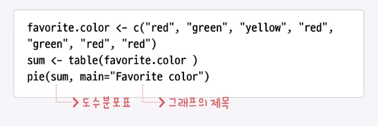


favorite.color<-c("red","green","yellow","red","green","red","red")
sum<-table(favorite.color)
pie(sum,main="Favorite color")
원 그래프 참고 사이트
www.statmethods.net/graphs/pie.html
Quick-R: Pie Charts
Pie Charts Pie charts are not recommended in the R documentation, and their features are somewhat limited. The authors recommend bar or dot plots over pie charts because people are able to judge length more accurately than volume. Pie charts are created wi
www.statmethods.net
※위 자료는 K-MOOC 단국대학교 오세종 교수님의 R 데이터 분석 입문을 참고하였습니다.